
Ovice Go: Meetings App
Designing a Mobile Office Experience on the move.
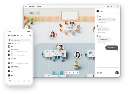
About Ovice Go
oVice combines Voice, Video, Virtual, and Office into an integrated platform.
Born in Japan out of the need to communicate in a remote world, oVice grew to encompass a devoted following in Japan, Korea, and Vietnam. With over 2,300 companies and approximately 1 million users, oVice was able to connect work, education, community, and events together via the web.
To improve flexibility and return to hybrid and on-site work, Design suggested a roadmap to create a Mobile App rather than continue improving the mobile web app. This would allow for meetings and chatting with teammates away from the desk.
Team: 3 Product Designers, 1 Product Manager, 3 Engineers
Timeline: May 2023- Sep 2023 (Initial Design), Dec 2023- Jan 2024(Iterations & Rollout)
Tools: Figma, Notion, Linear, Asana, Slack, Userflow, Maze, Amplitude

The Problem
While Ovice started as a Desktop Web App, the shift towards hybrid and in-office work highlighted the growing need for on-the-go functionality. An analysis of user behavior and devices revealed a constant upward trend in Mobile Web usage, increasing from under 100 per week to over 6,000 devices weekly. Recognizing the user demand for seamless team participation on mobile devices, the Design Team was challenged to address user concerns, such as battery drainage and limited navigational options within the Mobile Web, and develop a user-friendly Mobile App, prioritizing features like chat, video calls, space maps, and quick status.
Amplitude Findings
Increases from 84 mobile devices accessing Ovice during the work week to approximately 6,121 mobile devices
Biggest Increases were iPhone and Chromium OS devices
Increase of 17% in bug reports and improvement requests regarding mobile web.
Many features of the Desktop Web App were not optimized for mobile web, moving this project to high importance


The Goal
The primary objective of introducing the Mobile App was to enhance the experience of on-the-go work, eliminating the need to transition entire teams to external meeting applications like Zoom. Anticipating improved usability and heightened popularity, the Mobile App paved the way for subsequent feature developments. These included functionalities like Bluetooth beacon location tracking, desk or room reservations, and enhancements to user status. The app's availability on Android and Apple app stores would be a boost in visibility and attract increased user engagement from other countries.

Discovery and Analysis
Scoping, User Interviews, Secondary Research, Competitive Study:
To start the scoping process, the Product Managers and Engineering teams decided review the original “1.0” version of Mobile- a early vision project done by an external design firm. The current design team would then do a thorough review of “1.0”, and make updates to create our “2.0” MVP while also continuing with secondary research and competitive study. Our core focus would be to improve the chat feature, allow video meetings, and a visible map to move around on.

Competitive Study Sampling
Discovery

Insight Summary
In Multi Person Video calls, it is important to allow the user to toggle among different screens, wether it be a screenshare, video share, or message sent. Apps without the seamless change in actions create disruptions in work.
Screen size is limited in space- ensuring top level functions that are visible.
Because of the screen real estate, it was most important to be able to see a visual overview of available users and statuses.
Only one direct competitor offered map movement in a mobile app (Teamflow). However, most other direct competitors used mobile web usage rather than app usage.
Being able to seamlessly move to other applications while still connected to the meeting platform is very important. Example: Checking your email while still listening or speaking in a meeting.
Reactions like emojis may not have seemed like a important factor, but to our specific users in Japan and Korea, the functions were used often as a form of participation.
Although the options of having video effects, like blurred backgrounds, background images, and filters were great and made meetings fun, we were able to agree as a team that these could be added post MVP.
“I would like a way to use one application for all my office meeting needs. Right now, I need to log into Ovice, Slack, and Zoom and move back and forth. My team never knows which app to contact me on when I’m away from my desk.”
“Our office and warehouse workers are not always at their desk, as they are moving around the office. It would be nice to see if someone is busy, and reach them when they are away from the keyboard.”
Process

Analysis
“It’s frustrating for me to be working on-the-go. Joining an Ovice meeting on my phone’s safari app drains my battery, and if I navigate away from the page, my connection is lost”

Discovery: Scoping, Internal User Interviews, Secondary Research, Competitive Study
Analyze: Competitive Analysis, User Flows, Feature Brainstorm, Product Requirements
Prototype: Wireframes, Med-Fi/ Hi-Fi UI Screens, Screen Flow, Prototype
Test: Feedback Review, Iteration (In Progress), MVP Rollout
Customer Interview Quotes
Current vs Proposed User Flows for Joining Mobile Meetings
After looking into competitive research of various video calling and mobile game apps, we started to look into our own designs. Ovice had contracted a design agency in the beginning startup days to build up a concept for the Desktop Web and Mobile App. The Mobile app concept was worked on as a low priority backlog project, but through the growth of the company, it was now out of date as it was finally ready to launch.

Redesigning Mobile 1.0 to 2.0
Lo Fidelity to High Fidelity
Reviewing Mobile Version 1.0
Before starting the deign of the new mobile app, the design team performed an audit of the original MVP design created by the external design agency.
The MVP for Mobile 1.0, the main focus was to be able to see a list of users in the space, and mainly be able to see screen shares, speak and hear during meetings. No video capability or space movement was available at this time.
Some design points that we flagged immediately was the amount of variation of the current Ovice Design system from this point, including colors, imagery, icons, and even the screen size (iPhone SE) components initially designed.
We also wanted to review the implementation of responsive scaling on multiple different types of phones (Android and Apple), cross checking with the information we had found on Amplitude with what devices and phone sizes our users most commonly had.
Overall, because the amount of changes that have happened to Ovice from the start of this project, the re-design would need to start from scratch, moving feature functions into easier to understand locations, and finding a way to ensure onboarding was quick and easy while using as much screen real-estate as possible.
Below screens show the process of lo fidelity 2.0 designs while keeping some original design concepts from 1.0.

Ovice 2.0 Lo Fi Designs and Flows: Meetings and Screensharing


Hi-Fi Screens and Master Flows
With some feedback and iterations on Lo Fi designs, we worked with both the Dev and PM teams to decide what functions were most important to implement for Hi Fi. Working through flows for Sign Up, Meetings, Space Movement, Chatting, and Settings were most important to implement quickly, and we were able to break these designs into chunks, managing to split the work into multiple sprints.
See below for some flows and updates from 1.0 (design agency) designs to the MVP of Ovice 2.0 hi fi designs. Full hi fi design files are also available to review in closer detail below.

Main Hi Fi Screen Updates

Hi Fidelity Main Screens from 1.0 to 2.0, along with additional main screens from new features

Video Options in Meeting Rooms

User Settings Editing Flow

New Meeting Views for Video and Screenshare

User's Space Entry Update

Challenges and Learning Points
Challenges and Learning Points
Having an original unfinished MVP that was partially implemented created a rocky start. Having to ensure each team was on board with updating the Mobile product as a whole, and which portions of work could be later improved post MVP had to be continuously revisited.
Scope Creep was a big issue, and the timeline to finish this project was often pushed as teams needed to review and update requirements.
Because of the length of the project, the design system was also continuously being simultaneously updated. After finishing a majority of tickets, Design needed to return and re-visit all pages and flows to ensure all standards, like colors and icons, along with flows matched as closely as possible.
Thanks for scrolling through!